A modular identity system designed to communicate strength, structure, and scalability for a leading African tech company.
Redtech is a technology company focused on building efficient, well-integrated payment systems across Africa. The company delivers digital infrastructure, payment gateways, and connected systems that enable smart, secure transactions across the continent.
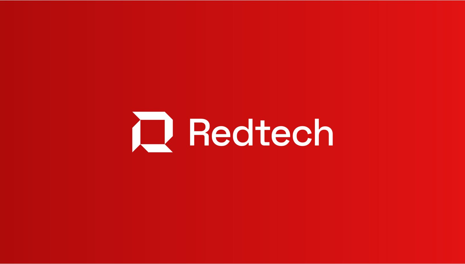
For this proposed rebrand, the design direction centered around the idea of order within complexity. The logomark, constructed by carving the letter R from a square, speaks to Redtech’s commitment to clarity, structure, and dependability in the digital space. The square form reinforces stability, a crucial value in fintech while the angular R brings movement and confidence.
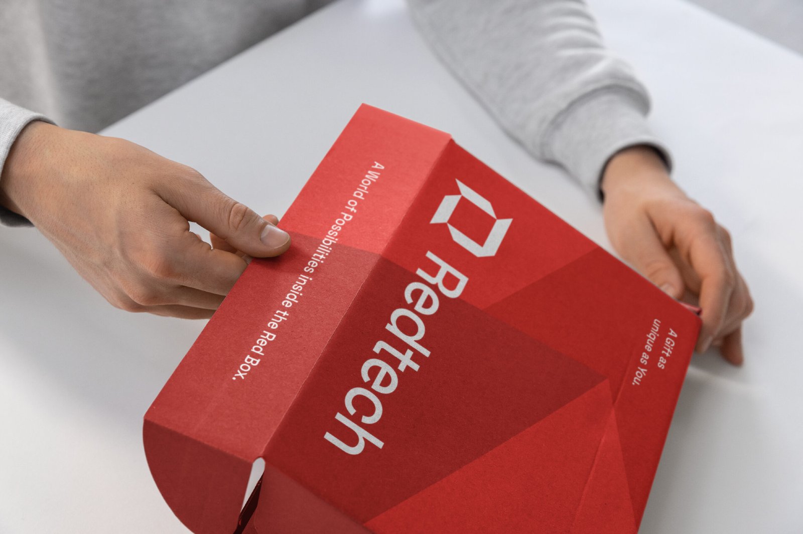
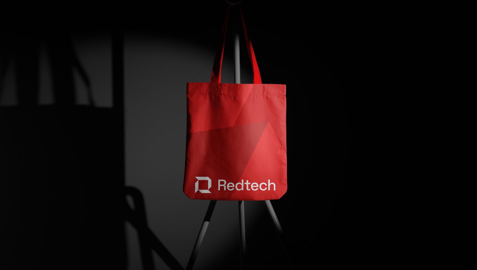
The identity extends into a modular visual system referred to as “The Block”, a brand language derived from the upper right arm of the R. These modular blocks form a visual grid that adapts across platforms, content types, and campaigns. Used as frames, overlays, or layout devices, the blocks create cohesion while allowing for dynamic expression.
A secondary layer of the system explores the 3D potential of the identity. The logomark is rendered as a sculptural object, a solid, geometric form embedded in a world of modular grids. These 3D studies help visualize Redtech’s infrastructure-focused mission: building reliable systems that connect people and economies.
Image treatments follow a defined language, using halftone and monochrome styles to create cohesion across photography. This approach allows Redtech to own a unique, recognizable voice across brand communications.
Though the company ultimately retained its previous identity, this proposal was developed to the final approval stage. It reflects a scalable, distinctive system built with strategic precision and a future-forward sensibility.