BOZ Jewelry operates at a unique commercial intersection, bridging the rich cultural heritage of its Nigerian origins with the demanding landscape of American retail. The challenge for Pertheon Studio was to develop a comprehensive visual identity capable of navigating these distinct territories without compromising its core essence. The brand required a singular, authoritative voice – one that could elevate its positioning from a regional retailer to a transcontinental luxury atelier. The resulting identity needed to articulate the duality of the brand: the raw, emotional artistry of bespoke jewelry making and the uncompromising technical precision of the modern luxury sector.
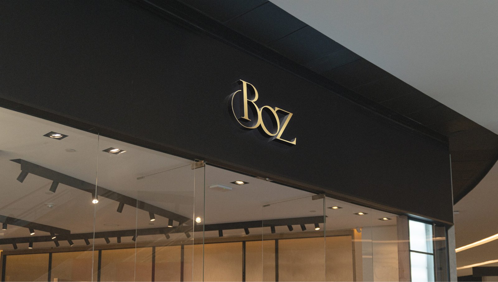
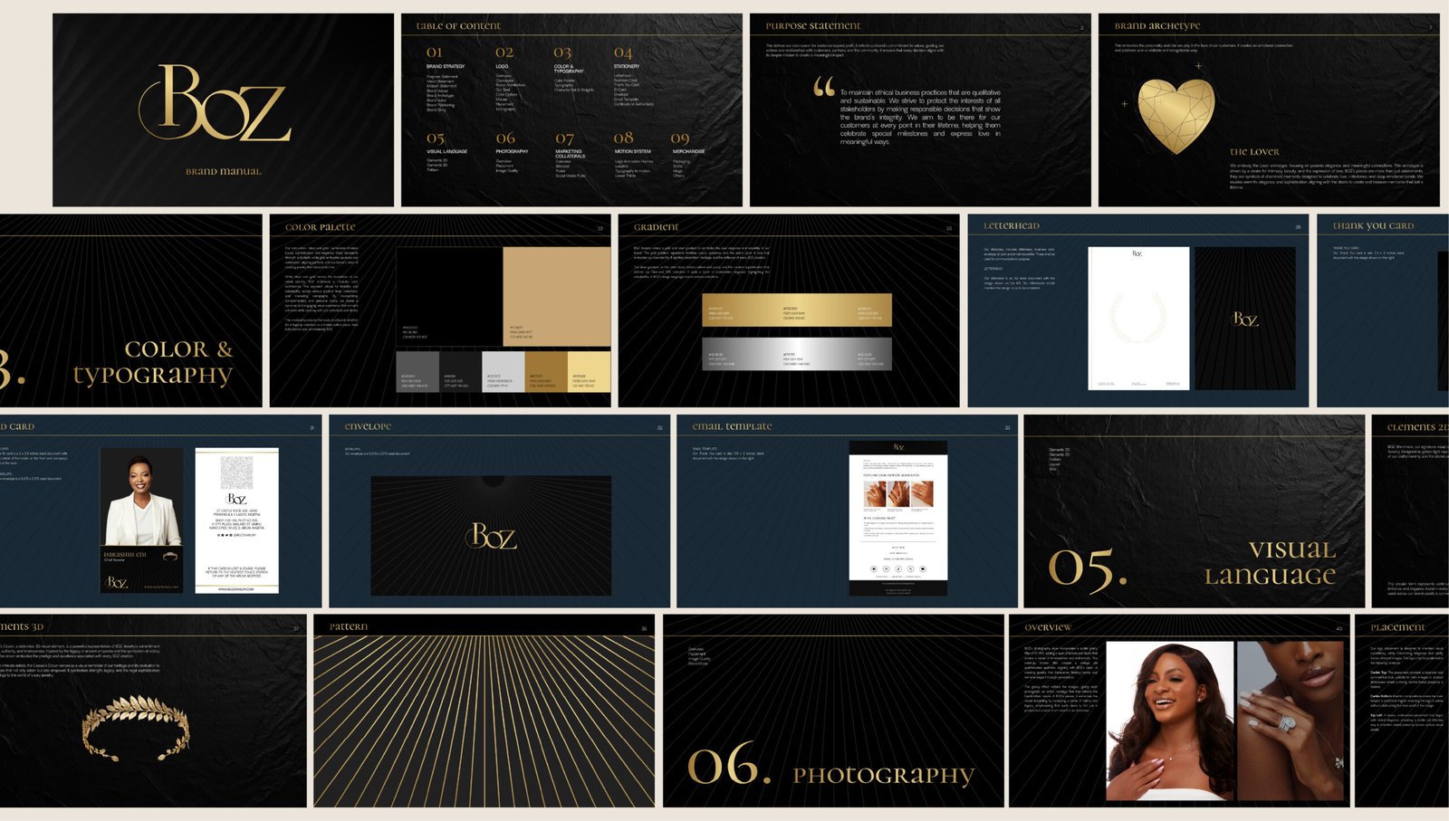
At the heart of the rebrand is a strategic positioning defined as “The Architecture of Legacy.” Fine jewelry is inherently architectural; it is meticulously constructed to endure, designed to hold intimate meaning, and engineered to be passed down through generations. The new visual language honors this permanence. Rather than relying on the superfluous ornamentation that often crowds the jewelry sector, the identity is deliberately stripped back to its structural essentials. This sophisticated reduction allows the craftsmanship of the product itself to take precedence, repositioning BOZ not merely as a purveyor of precious stones, but as a meticulous custodian of modern heirlooms.
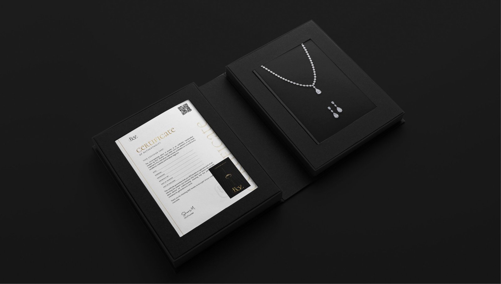
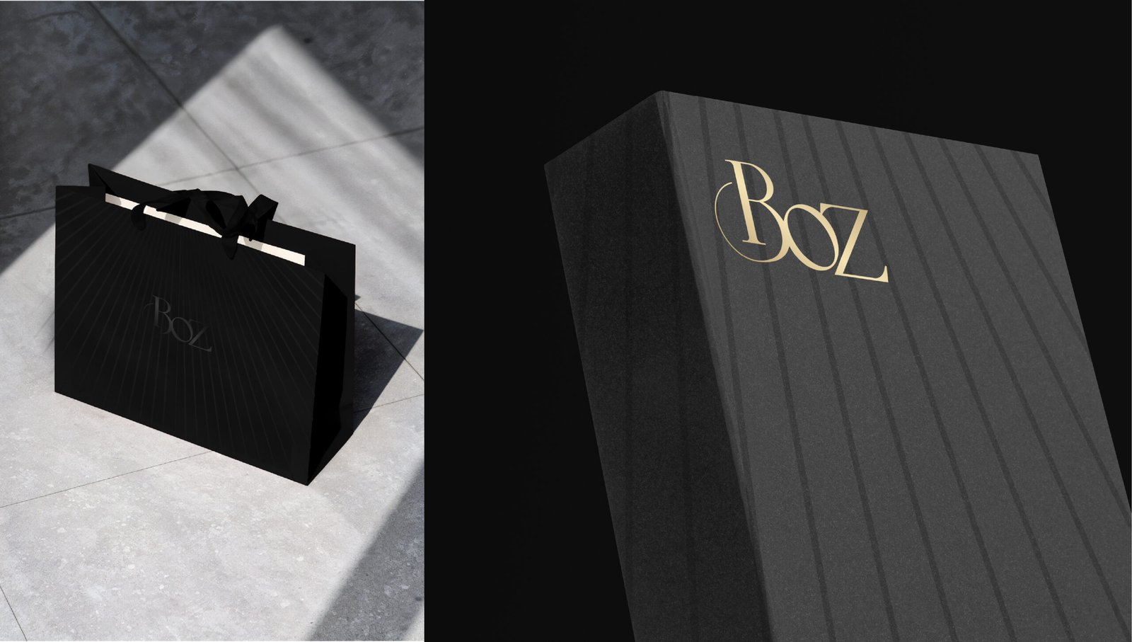
The visual execution is anchored by a rigorous typographic framework that balances classical elegance with contemporary restraint. Pertheon introduced a modular design system built upon a definitive, high-contrast “black and gold” palette. This elemental colorway eschews trend-driven aesthetics in favor of enduring sophistication, communicating immediate premium value across physical packaging, retail environments, and digital touchpoints. The custom typographic hierarchy provides a quiet, confident structure, turning complex product narratives and technical specifications into a seamless, highly legible brand experience.
Ultimately, by fusing cultural resonance with disciplined, systematic design principles, the new identity equips BOZ with a highly adaptable toolkit for global expansion. The cohesive visual strategy unifies the brand’s transcontinental presence, ensuring that every interaction, from the tactile unboxing experience to the digital storefront, feels deliberate and unified. Through this careful calibration of form, typography, and narrative, Pertheon Studio has established a foundational brand architecture that is crafted for love, and designed to last.